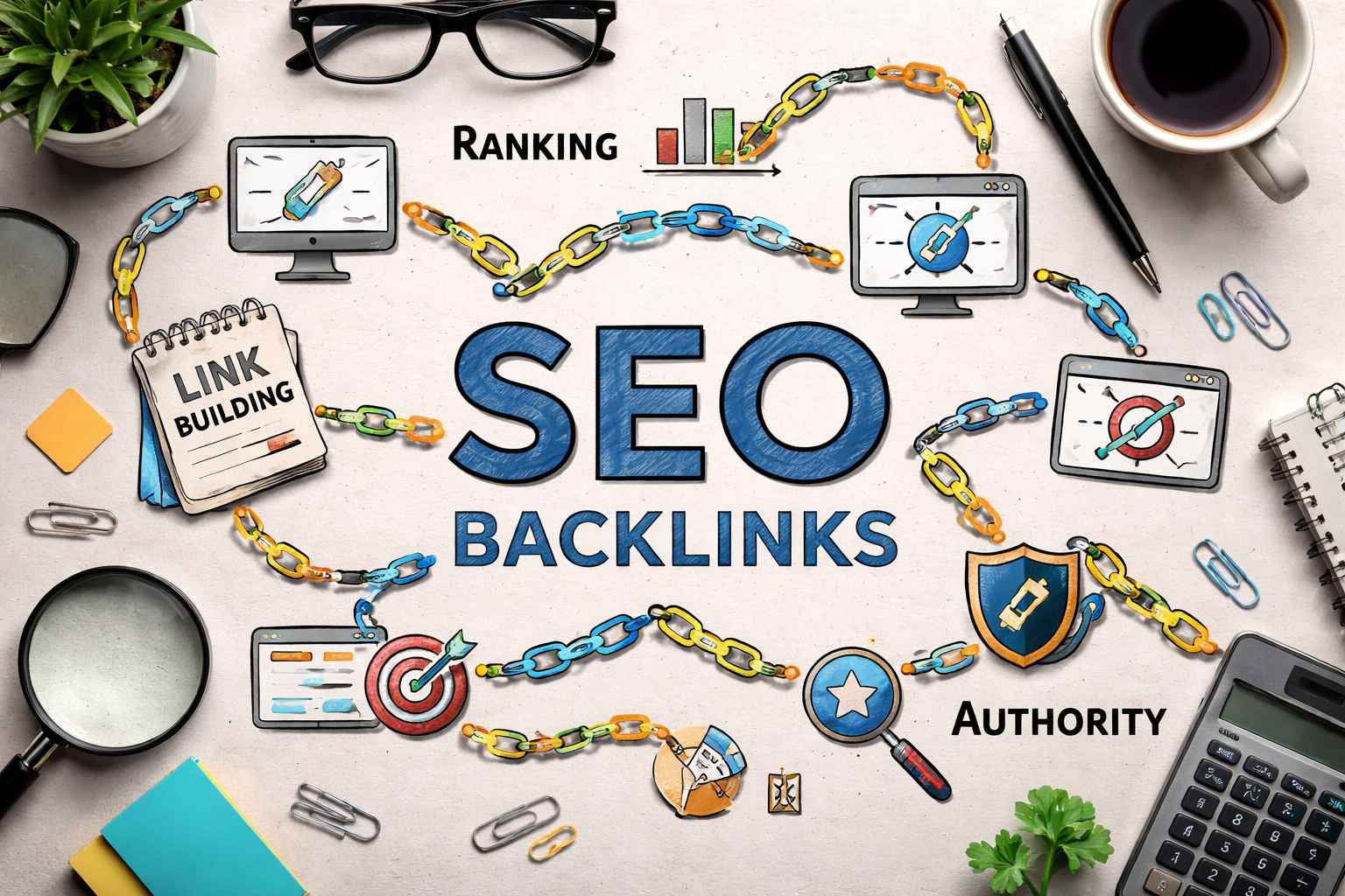


Dental service pages do the heavy lifting. They rank in search, answer anxious questions, and push a visitor toward a call or booking. When people bounce fast, it is rarely because they hate dentistry. It is because the page feels slow, confusing, or untrustworthy. Small fixes can change that quickly, even without a redesign. Discussed below are simple, practical ways to cut bounce rate on dental service pages.
Before you rewrite a single line, make sure the page loads fast and stays up. This begins with dental website hosting that is built for performance, security, and steady uptime. Be sure to also compress images, enable caching, and remove heavy plugins that block rendering. Ensure to test on mobile data, not just office WiFi. If your “Book Now” button appears late, visitors leave early.
Most visitors arrive with a specific question. Your headline should mirror it, and your first paragraph should answer the fear behind it. If it is a root canal page, address pain and timeline. If it is whitening, address the results and safety.
Be sure to add a short “Best for” line, then a three-bullet snapshot that covers cost range, appointment length, and what happens next. When the page confirms intent fast, people keep scrolling instead of bouncing.

A wall of text signals complexity and risk. Use short sections with clear labels: what it is, who needs it, what it feels like, and what recovery looks like. Add quick trust cues high on the page, not at the bottom.
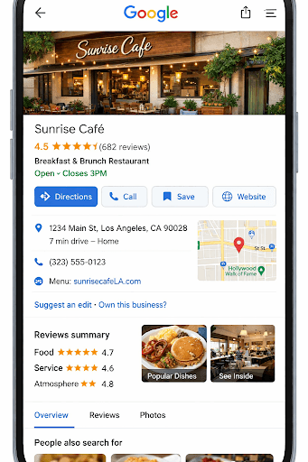
In addition, include credentials, a small review snippet, and one real photo of your team or operator. Use one labeled photo, and keep galleries light and fast. People relax when they can picture the experience.
A service page should not feel like a brochure. It should feel like a path. Offer two options: call or request an appointment, and keep both visible. Add click to call on mobile. If you can, use a sticky bottom bar with the phone number and a booking button, and be sure to include office hours.
If you use forms, keep them short: name, phone, preferred time, and one box for notes. Add a “what happens next” line so people know when you will respond.
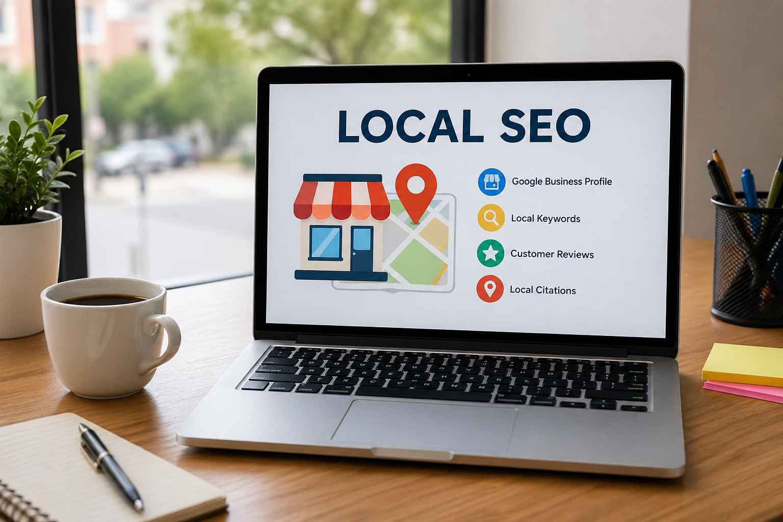
Small issues create doubt fast. Fix broken links, outdated hours, and confusing navigation labels. Show your location, parking notes, and accepted insurance basics on each service page. You should also add a short FAQ that tackles cost, pain control, and appointment length.
Additionally, make text easy to read, with comfortable spacing and strong contrast. Include a privacy note under forms, and show security badges only if they are real. Finally, test on a phone for sticky banners that cover buttons or content.
When you improve speed, intent match, skimmability, and next steps, visitors stay long enough to choose you. Make one change at a time, then watch behavior for a week. These small improvements add up over time, leading to more real calls, fuller schedules, and fewer visitors who leave without taking action.