


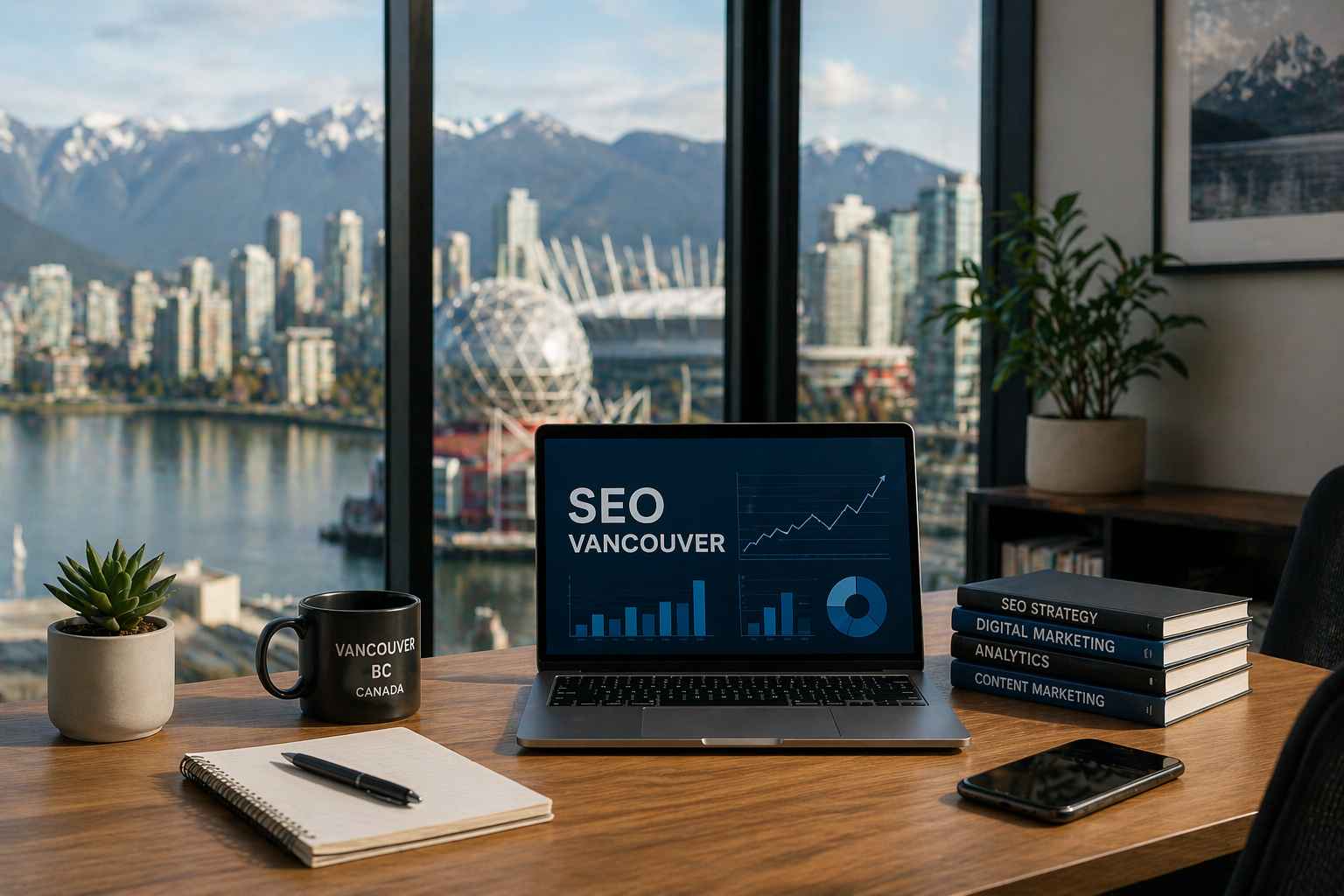


How to Create a Converting Landing Page
A landing page is a vital component of many companies online. They’re great for increasing your SEO ranking, promoting upcoming or newly released products or services, but most of all, they create an efficient buying experience for customers.
If you aren’t asking the professionals to design your landing pages for you, you need to think about how to create your own.
So, here are a few tips for excellent landing pages:
Create a Smooth Experience
When creating a new landing page, you need to consider it from a user’s point of view. Are you making the experience as smooth as it could be?
Don’t clutter your landing page with useless information. Just make sure it’s plain sailing.
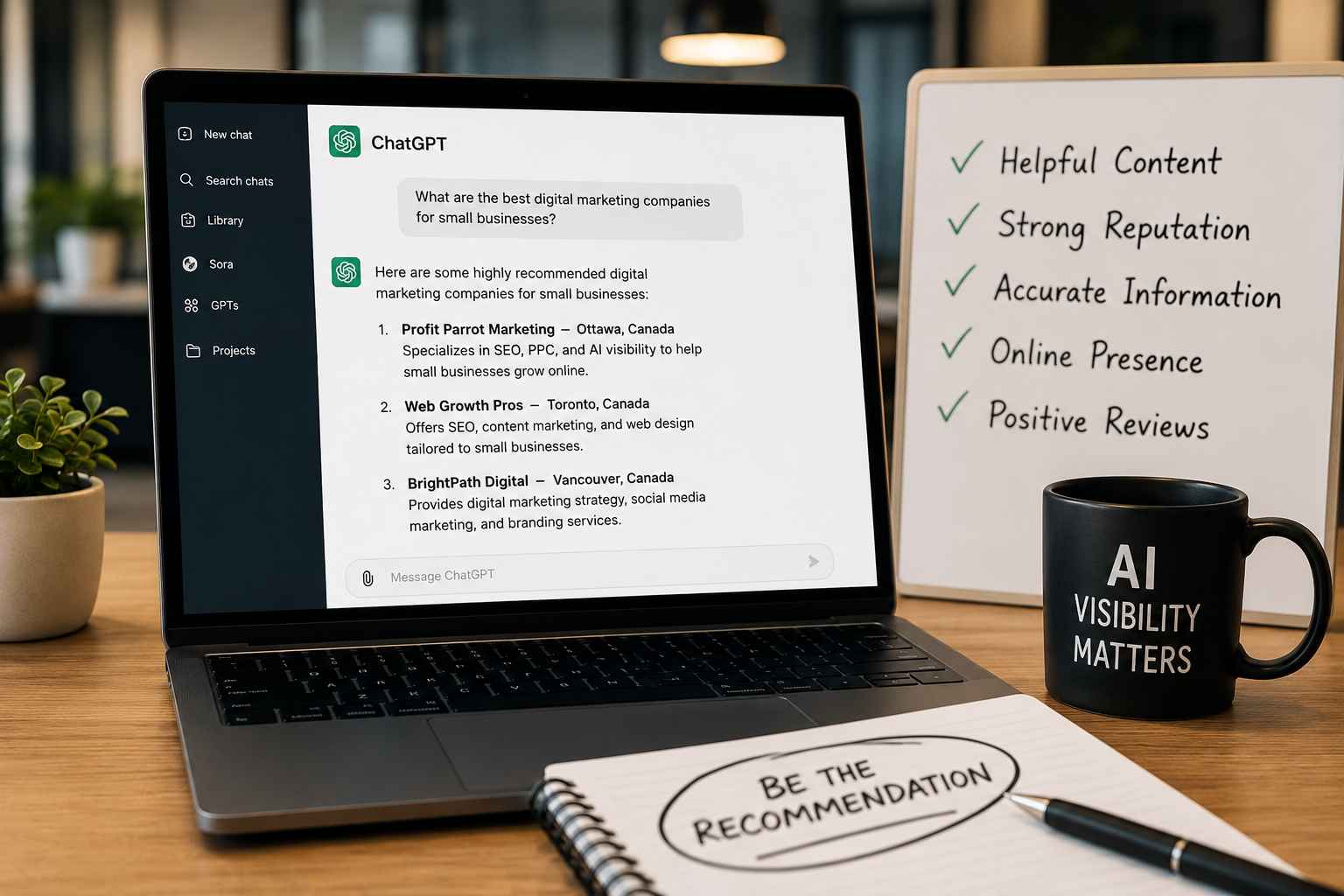
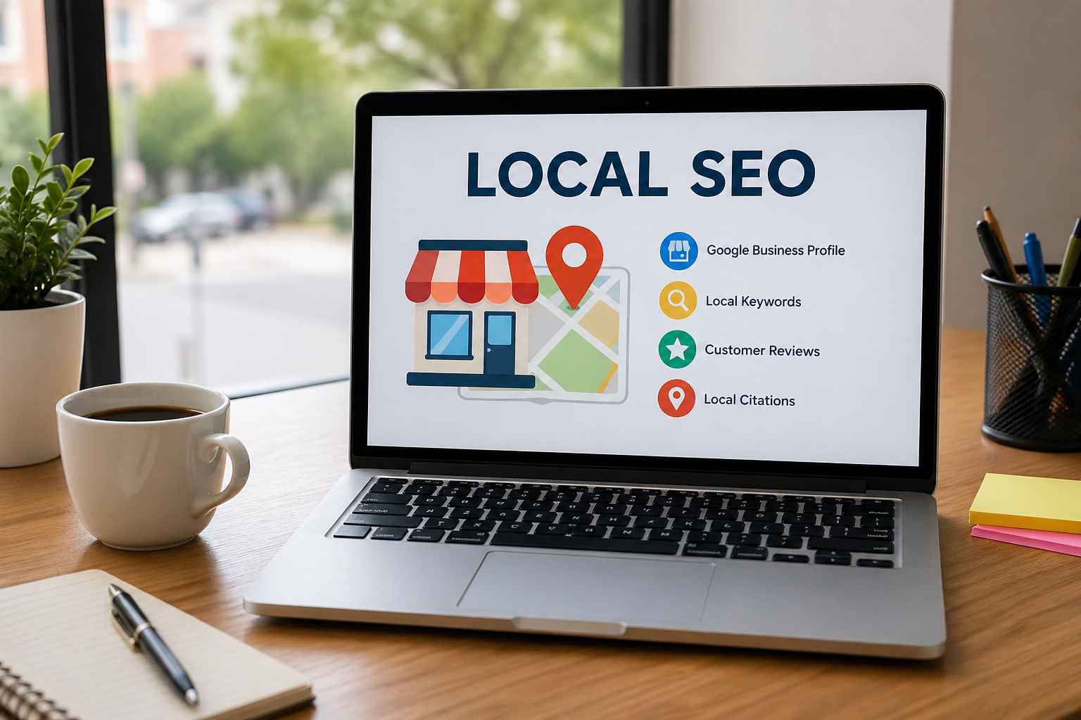
 Match Keywords
 Match Keywords
One of the key functions of a landing page on your site is to draw in organic traffic. Where a homepage might be a general catch all page for people to find through word of mouth or direct links, your landing pages are more likely to come up in searches.
So, ensure that you’re using your keywords intelligently.
Offer Something Compelling
Whatever you’re using your landing pages for needs to be compelling. If it’s a new product, you have the allure of something new and shiny; if you’re offering a new service, then it’s the opportunity to get your expertise. Whatever it is, make sure it stands out from the crowd.
These pages are often used to get people into your funnel, and if you aren’t using this as an opportunity to get your most exciting offering in front of customers, you’re missing out!
Above the Fold
This is a term that needs some explaining. Anything that is visible on the page as soon as it loads is considered “above the fold”. It comes from physical media, particularly newspapers, where you could read the headline “above the fold of the paper”, without opening or buying. It would entice people to pay for the newspaper.
Here, we’re using above the fold to mean that the user doesn’t have to go through the effort of scrolling to find what it is you’re offering. Make sure your big green “sign up” button is above the fold.
Strong Call to Action
Speaking of big green buttons: ensure your call to action is as strong as it can be. Don’t use language that suggests the user can ignore the offer.
“Sign up for our newsletter” is infinitely better than a generic “click”, because the first is telling the user exactly what you want them to do and gives them a clear reason for doing so.
A strong call to action is related to the offering you are using to capture users’ interest, and whether you’re making sure it’s visible and not drowned out by other information.
Desktop & Mobile Friendly
Something that is becoming more and more important is the responsive nature of a website and whether it can adapt based on the way the user is accessing your website
Try and experience your landing page (or website as a whole) on mobile devices as much as you check on a desktop computer. If you don’t, you might find that your audience is missing key information because it’s being lost on smaller screens!
Limit External Links
Lastly, limit the number of external links you have on your landing pages. Why give your potential customers an excuse to leave your page? Your page/site/company has everything they need, right? So give them the relevant information, a great call to action, and nothing else.
Checking it Twice
Alright, so there were our best tips for a landing page checklist. Have you got all of these things? If not, why not?
If you aren’t sure you can do this all yourself, let the professionals at Profit Parrot speak to you about our solutions.