






















Typography isn’t usually the bottleneck in UI design. Neither is layout. It’s iconography.
When you are doing website design or app development, when a team lacks a dedicated illustrator, they scavenge. You grab a “settings” cog from an open-source pack, a “user” profile from a dusty hard drive, and a “dashboard” icon from Google Images. The result? A Frankenstein interface. Stroke weights clash. Corner radii fight each other. Half the icons are filled; the rest are outlined.
Icons8 tackles this fragmentation not just through volume, but through strict stylistic enforcement. With over 1.4 million icons, the value isn’t just availability. It is the power to keep a product visually unified without drawing a single pixel.
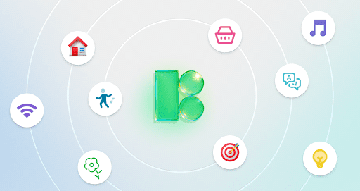
Marketplace models fail here. When thousands of designers upload uncoordinated work, you get visual dissonance. Icons8 takes a different path by producing assets in-house or curating them into rigid style guides.
Select a style-Material Outlined, Windows 11, or iOS-and you aren’t getting a sample pack. You access a library of thousands of icons (30,000+ for iOS 17 alone) sharing the exact grid, stroke thickness, and aesthetic rules.
Scaling becomes manageable. You might start an app needing only standard navigation symbols. As features expand, you suddenly need obscure symbols for niche industries. Small libraries hit a wall here, forcing you to draw the missing piece yourself. Because Icons8 goes deep, that obscure symbol likely already exists in the exact style of your navigation bar.
Managing a design system means ensuring every contributor uses the right assets. Here is how that looks in practice.
A designer builds a high-fidelity prototype for an iOS application. Apple’s Human Interface Guidelines demand strict adherence. Instead of drawing icons or hunting down SVGs one by one, the designer opens the Figma plugin (or the Pichon Mac app).
They select “iOS 17.” The database filters to show only icons matching Apple’s language-available in Outlined, Filled, and Glyph variations. Drag an icon to the canvas, and it’s already a vector.
Project requirements often shift. Maybe the product manager decides the app needs a “friendlier” vibe. No redrawing necessary. The designer switches the filter to “Cute Color” or “Hand Drawn.” The system updates the aesthetic while keeping the semantic meaning intact.
Need a niche symbol that doesn’t exist? Use the “Icon Request” feature. Get 8 likes from the community, and the team produces it. The library becomes a living resource, not a static zip file.
The “hand-off” gap often kills momentum. Designers provide static images, but code needs flexibility.
In this scenario, a developer builds a responsive web dashboard requiring animated status indicators. The designer requested a specific loading animation but forgot the code.
The developer navigates to the animated icons section, which houses over 4,500 assets. They find the required loader. Instead of downloading a heavy GIF that scales poorly, the developer selects the Lottie JSON format. Now they have a lightweight, code-based animation that stays crisp on high-density screens and loads instantly.
For static icons, bypass image files entirely. Select “SVG Embed” or “Base64” to paste the HTML fragment directly into the codebase. Updating a legacy site? Use the CDN link. Customize colors via URL parameters without ever opening an image editor.
Product Marketing Managers often need professional decks but lack vector software skills. They need on-brand assets fast.
Two minutes. Zero external design tools.
Standard UI icons are the foundation, but the library stretches into expressive categories like 3D Fluency, Liquid Glass, and emojis. Sometimes an interface needs personality.
Specialized styles let the tool serve more than just utility apps. A landing page for a playful consumer product might use “Cloud” or “Doodle” styles, breaking the rigid grids of Material Design.
Icons8 vs. Open Source (Heroicons, Feather):
Packs like Feather are great for small projects and cost nothing. But they lack scope. A typical pack holds 200-300 icons. Need “biometric scanning”? You hit a dead end and break consistency. Icons8 wins on volume.
Icons8 vs. The Noun Project:
The Noun Project excels at unique, artistic concepts by aggregating distinct artists. That is a weakness for UI design. Finding “home,” “search,” and “settings” icons that look related is a nightmare. Icons8 standardized packs guarantee visual harmony.
Icons8 vs. In-House Design:
In-house sets offer control but demand maintenance. Every new feature requires a designer to draw new assets. Icons8 outsources that labor. You lose exclusive ownership but gain speed and reduced overhead.
Even with a massive library, this isn’t the right fit for every project.
Use Collections for Batch Processing
Stop downloading one by one. Drag icons into a “Collection.” Recolor the whole set with a preset palette or HEX codes, then bulk download as a sprite or individual files.
Check “Simplified SVG”
Downloads default to “Simplified.” This merges paths for web performance. But if you plan to animate in After Effects or modify geometry, uncheck this box to get raw, editable paths.
Leverage the “Popular” Category
Tight budget? The “Popular,” “Logos,” and “Characters” categories allow vector downloads without a paid plan (attribution required). Perfect for high-quality social logos.
Utilize Search by Image
Have a blurry screenshot of an icon from another app? Drag it into the search bar. AI finds the closest match. It’s faster than guessing keywords.
Copyright © 2025 – Profit Parrot Marketing