












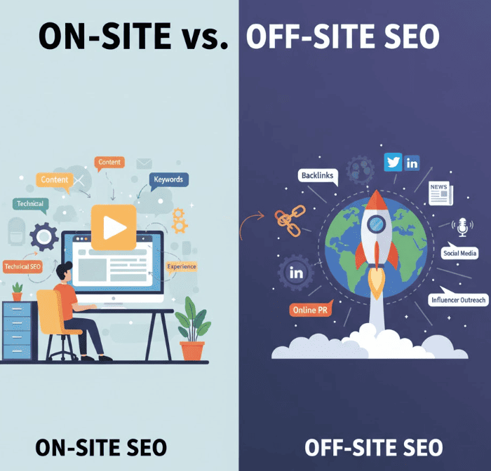





Responsive web design directly affects search visibility: sites that adapt smoothly to devices tend to rank better because search engines prioritize mobile usability, performance, and user engagement.
Search engines now index and rank pages primarily using the mobile version of content. That change — mobile-first indexing — makes the way your site adapts to smaller screens a ranking signal in practice. When your pages are responsive, you serve the same content and URL for desktop and mobile, consolidating link equity and simplifying indexing. Conversely, poor responsive implementations can hide content, break structured data, or unintentionally slow the mobile experience.
Technical SEO for responsive sites focuses on performance, crawlability, and markup parity. Below are the high-impact items to get right.
Experts suggest focusing on perceived performance first: deliver the above-the-fold content and critical resources for the viewport quickly, then load secondary assets asynchronously.
Search is increasingly about user satisfaction. Responsive designs that respect mobile interaction patterns improve trust, conversions, and indirect ranking signals.
Accessibility features — logical heading order, alt text, and focus management — are easier to maintain in a single responsive codebase and benefit both users and search crawlers.
Below are practical patterns I use as a front-end SEO consultant. These directly affect LCP and CLS when executed properly.
Use percentage-based widths and breakpoints. Example:
/* Simplified responsive container */
.container { max-width: 1200px; margin: 0 auto; padding: 0 16px; }
.column { width: 100%; }
@media (min-width: 768px) { .column { width: 50%; } }
@media (min-width: 1024px) { .column { width: 33.333%; } }
Serving the right image for device width and DPR reduces bytes and speeds up LCP. Use width descriptors and include modern formats:
<picture>
  <source type="image/avif" srcset="hero-400.avif 400w, hero-800.avif 800w, hero-1200.avif 1200w" sizes="(max-width: 600px) 100vw, 1200px">
  <source type="image/webp" srcset="hero-400.webp 400w, hero-800.webp 800w, hero-1200.webp 1200w" sizes="(max-width: 600px) 100vw, 1200px">
  <img src="hero-1200.jpg" srcset="hero-400.jpg 400w, hero-800.jpg 800w, hero-1200.jpg 1200w" sizes="(max-width: 600px) 100vw, 1200px" alt="Product hero" width="1200" height="600" loading="eager" decoding="async"/>
</picture>
Notice the explicit width and height on the <img> tag to prevent layout shifts. This pattern reduces LCP and CLS when combined with efficient formats.
Key optimizations that move Core Web Vitals and search metrics:
Example: If LCP is a hero image, prioritize it: preload the most likely candidate and serve an appropriately sized image for mobile. Use <link rel="preload" as="image" href="/path/hero-800.webp" imagesrcset="/path/hero-400.webp 400w, /path/hero-800.webp 800w" imagesizes="(max-width:600px) 100vw, 800px"> where supported.

Poor responsive implementations can harm rankings. Below are common issues and quick remedies.
| Issue | Why it hurts SEO | Fix |
|---|---|---|
| Missing responsive images | Large downloads on mobile → slow LCP | Implement srcset/picture and compress images |
| Different or missing meta/structured data | Inconsistent indexing and SERP display | Ensure identical JSON-LD and meta tags on mobile |
| Hidden content via CSS (display:none) | Content may be ignored or flagged | Use progressive disclosure patterns with accessible controls |
Run these tools and map the outputs to fixes:
Use this step-by-step troubleshooting approach:
Scenario: An e-commerce site with an older m-dot mobile site migrated to a single responsive codebase. Actions taken:
Results (three months post-launch): mobile organic traffic +28%, average LCP reduced from 3.8s to 1.9s, mobile rankings for 12 target keywords moved into top 3. The key takeaway: targeted responsive improvements that address Core Web Vitals can produce measurable ranking and conversion gains.
Use this troubleshooting map during audits:
| Observed Symptom | Test | Fix |
|---|---|---|
| High LCP on mobile | Lighthouse > Performance & Waterfall | Optimize hero image (srcset, compress), preload, reduce TTFB |
| Layout shifts | DevTools & Lighthouse > CLS traces | Specify width/height or aspect-ratio, reserve space for ads/iframes |
| Mobile usability errors | Mobile-Friendly Test & Search Console | Fix viewport meta, touch target sizes, font legibility |
In my experience, the single biggest win when moving to responsive is consolidating SEO signals. One codebase means one source of truth for content, metadata, and structured data — it makes audits far simpler and faster.
Yes. Responsive web design improves SEO by providing a consistent, single-URL experience that simplifies indexing, reduces duplicate content, and typically improves user experience — which indirectly affects ranking signals. Ensure mobile content parity and good performance to realize those benefits.
Responsive design uses CSS to change layout across breakpoints and retains the same HTML for all devices, which is generally easier for SEO. Adaptive (or dynamic serving) can serve different HTML based on device and requires strict server-side checks and correct Vary headers; mistakes here can lead to indexing problems.
Responsive images significantly improve LCP by serving appropriately sized files to mobile devices. They also reduce CLS when you declare image dimensions or use CSS aspect-ratio. Implementing srcset/picture and modern formats yields measurable improvements in lab and field data.
Run Google’s Mobile-Friendly Test, Lighthouse (in Chrome DevTools), PageSpeed Insights, and monitor Core Web Vitals in Search Console. Additionally, perform manual inspections on real devices and run A/B tests for layout changes that affect conversion.
Responsive web design and SEO are not separate efforts — they are complementary. By prioritizing mobile performance, clear structure, and consistent markup, you improve both user experience and search visibility. Use the code snippets, checklists, and testing steps above to make incremental, measurable improvements.
For a deeper audit and hands-on help, get in touch with our website design experts to turn your responsive implementation into measurable SEO gains.
Copyright © 2025 – Profit Parrot Marketing